We are so excited to share the following article about the impact of color in educational spaces that one of our interior designers, Maria Thompson, NCIDQ, wrote. Check it out below! Great job, Maria!
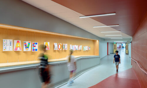
Randall Perry Photography- Glens Falls Middle School
The 21st century has brought a profound reimagining of what learning spaces can and should be, moving far beyond the traditional model of rows of desks facing a chalkboard.
Research consistently demonstrates that students who experience their school building as personally meaningful and spatially coherent show higher levels of engagement, lower rates of absenteeism, and greater care for their physical environment.
As one of the most immediately perceptible properties of any space, color serves as a primary medium through which these connections are formed. Beyond its aesthetic value, color can be harnessed through two distinct modalities: as a pedagogical tool that influences mood, attention, and cognitive performance, and as a branding tool that reinforces institutional identity, community pride, and belonging. When integrated intentionally, these dual functions create learning environments that are both engaging and inclusive.
Color as a Pedagogical Tool
Studies in environmental psychology indicate that different hues carry distinct psychological effects on attention, creative output, anxiety regulation, and spatial cognition in learners of all ages. Warm hues like yellow and orange can stimulate energy and creativity, while cooler blues and greens tend to promote calm, focus, and sustained concentration. In early childhood settings, thoughtfully curated color palettes can support emotional regulation and a sense of security, whereas overly stimulating or chaotic color schemes have been linked to increased anxiety and reduced attention spans.
A strategy for leveraging these psychological effects is cognitive anchoring – using specific hues to “anchor” psychological states to their appropriate tasks or programs. When different learning zones are imbued with distinct colors – a warm amber reading corner, a cool blue collaborative workspace – the brain begins to associate those hues with specific modes of thinking. Over time, simply entering the blue zone can cue a shift into collaborative thinking, reflecting how the brain encodes context alongside memory, a phenomenon psychologists call encoding specificity.
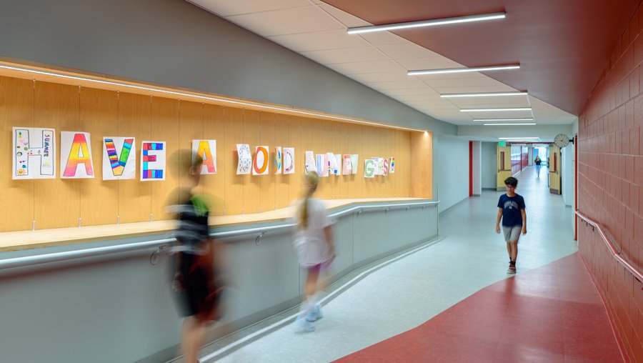
David Lamb Photography – Saratoga Springs High School Cafeteria
Color also functions as a navigational and organizational system. Color-coding different zones, floors, and programs throughout a building creates a spatial grammar that reduces the cognitive load of navigation – a significant benefit for students with learning differences, anxiety disorders, or limited familiarity with complex buildings. Simple interventions, like painting classroom entries different colors according to floor level, can dramatically improve a student’s daily experience.
Finally, student-led color interventions, such as murals and custom environmental graphics, represent color-as-pedagogy in its most active form. This approach enacts the third-teacher principle: the act of shaping one’s environment is, in itself, an act of learning.
Color as a Branding Tool
School colors carry significance that extends well beyond sports uniforms and graduation banners. When thoughtfully woven into the fabric of a learning environment, they create a cohesive visual narrative that communicates to every student, staff member, and visitor: “This is who we are.” This sense of branded placemaking fosters school spirit and emotional investment in the community, giving students something tangible to identify with and take pride in.
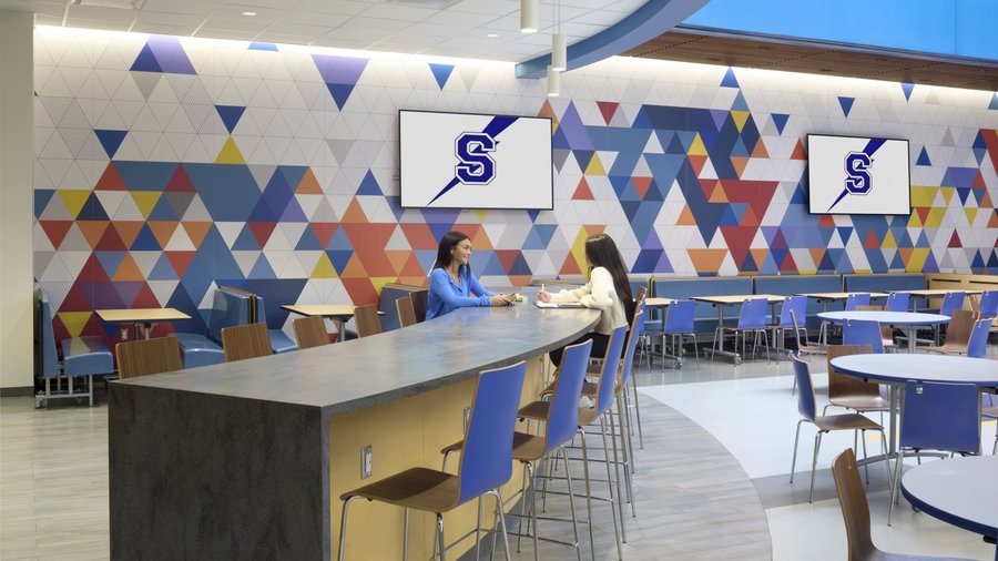
Like branding and identity in corporate and hospitality projects, school branding has the power to create a consistent throughline in the user experience, with varying intensity depending on the program and space. Athletic spaces, for example, should turn up the volume with bold, vibrant school colors and mascot displays that actively promote team spirit. In corridors and common areas, however, school branding can maintain presence without becoming loud or disruptive to students navigating these spaces daily.
One effective strategy for maintaining this through line across different programs involves choosing a consistent medium. Room signage and door frames might feature school colors throughout the building, while the school logo or mission statement appears intermittently along corridors, creating visual rhythm without overwhelming the space.
Randall Perry Photography- Cairo-Durham High School
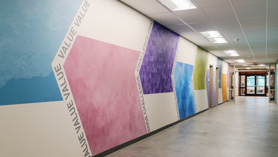
Another approach is establishing a supplemental color palette that expands the visual vocabulary of the brand and creates opportunities for variation. For instance, if the primary school colors are royal blue and white, designers might propose incorporating two to three additional shades of blue alongside light and dark gray accents.
Harnessing Color’s Dual Functions to Create More Engaging Environments
When designers and administrators strategically leverage color’s dual role – both as a pedagogical tool rooted in cognitive science and as a branding element that creates narrative and sense of place – they can create learning environments that are not only educationally effective, but also deeply meaningful to their communities. The key lies in developing consistent, intentional implementation strategies that allow these two functions to work in harmony rather than in competition.
Ultimately, thoughtful use of color represents more than an aesthetic choice. It becomes a pathway to creating educational spaces that truly serve both learning and belonging.

Maria is a certified interior designer; her focus on designing learning environments includes work with the Shenendehowa Central School District, Saratoga Springs City School District, Hudson Valley Community College, and Skidmore College. Maria is a graduate of The New School University in New York City.